Dental Success Institute (DSI) is a premium coaching and educational platform serving practicing dental professionals through tiered memberships, coaching programs, events, and educational resources.
I led the visual design and front-end implementation of a redesigned digital experience focused on transforming an outdated, marketing-heavy site into a refined, editorially driven educational platform with clearer hierarchy, stronger perceived credibility, and a more premium brand presence.
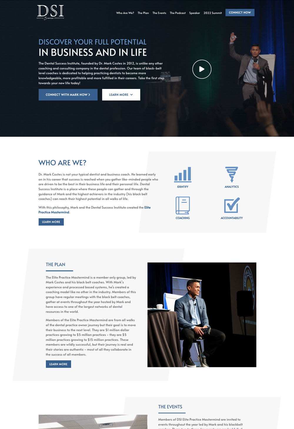
The existing website suffered from several UX and branding issues that weakened the perceived value of the organization’s premium offerings:
From a UX perspective, educational content, coaching benefits, and membership tiers competed for attention without a clear hierarchy or intuitive progression for the user.
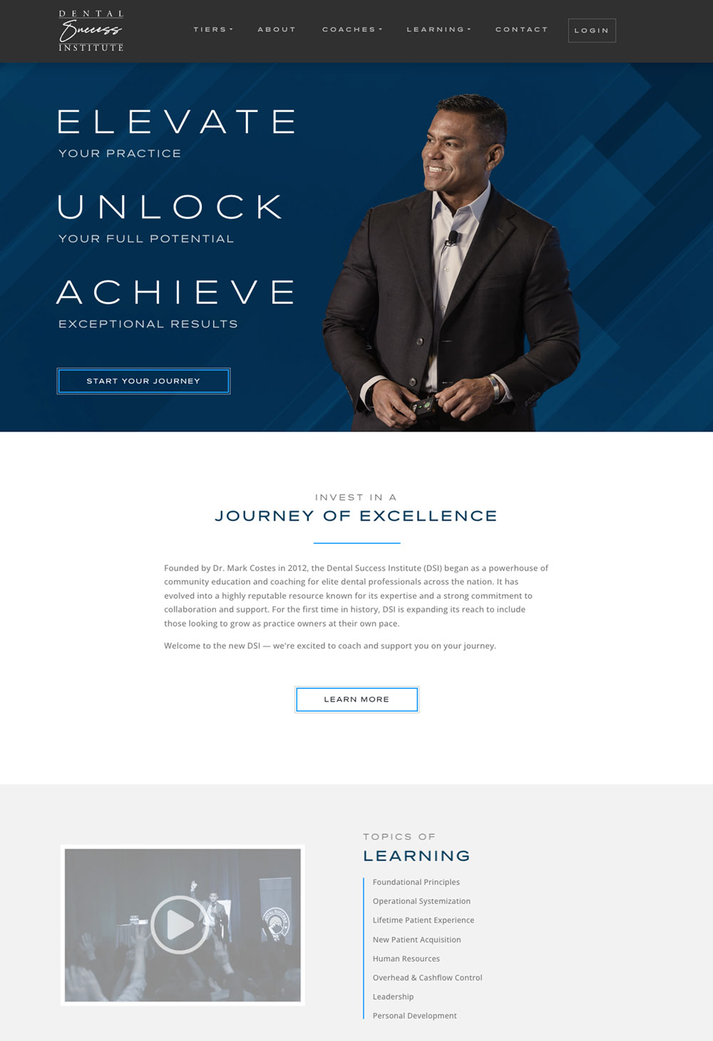
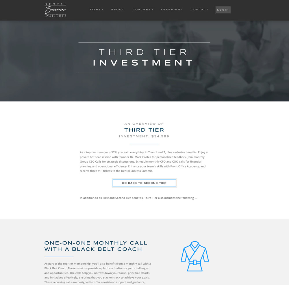
The redesign focused on elevating the platform into a more modern, refined, and trustworthy educational experience for an affluent professional audience.
I led the visual design and front-end execution of the redesign, contributing across design direction, implementation, and final presentation quality.
The project began as a fully functional front-end prototype before being ported into WordPress using custom templates and ACF-based content structures for the agency content team.
Strong typography, spacing, and layout rhythm created a more refined reading experience aligned with a professional educational audience.
The redesign reduced aggressive marketing noise in favor of whitespace, balance, and a calmer user experience.
Tiered offerings were visually clarified to help users understand membership benefits and progression paths more easily.
Custom icons and SVG illustrations created a cohesive visual language while avoiding generic stock-icon aesthetics.
Layout, pacing, typography, and interaction decisions were refined for an affluent and highly educated professional audience.
Dense marketing-heavy content was simplified into cleaner, more readable structures that guided users naturally through the experience.
The project required balancing elegant editorial presentation with the practical demands of marketing content, stakeholder revisions, and CMS limitations.
The redesign delivered a more polished, readable, and cohesive educational platform experience.
The final experience elevated the organization’s digital presence into a more modern, trustworthy, and professionally aligned educational platform.
This project represents one of my strongest examples of restraint, editorial thinking, and compositional maturity as a designer.
I’m especially proud of the typographic refinement, custom iconography, calm visual pacing, and the balance between elegance, readability, and real-world conversion goals.
More than any single visual element, I’m proud of how the redesign transformed a cluttered and marketing-heavy experience into something more refined, composed, and visually confident.
The project reflects my belief that sophisticated digital experiences are often created not by adding more, but by carefully removing distraction and guiding users with clarity, restraint, and purposeful hierarchy.
![]()